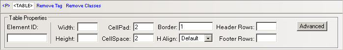
In the Element ID text
box (displayed in Simple view)
enter the value for the id attribute. It will
uniquely identify the element (table) in page.
In the Width text box
(displayed in Simple view) specify
a new width for the table. The width can be given in either number of
pixels or percentage of the page width. If you enter the width in pixels
and the value is greater than 1000, a pop-up window will display the error
message: "The value must be lower than 1000."
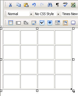
The default width of
the table is rather tight (each column expands wide enough for the space character to fit inside).
In the Height text box
(displayed in Simple view) specify
the new height of the table. The height can be given in either number
of pixels or percentage of the page height. If you enter the height in
pixels and the value is greater than 1000, a pop-up window will display
the error message: "Value too big! Must be less than 1000."
Usually though, the table height is not set because it changes (increases)
anyway as you type text in the table cells.
The default height
of the table is rather short (each column expands deep enough for the
mouse cursor to fit inside).
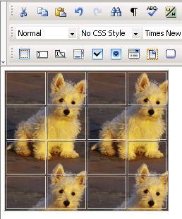
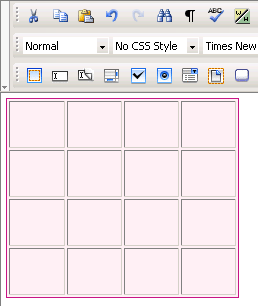
Note: Table handlers show once a table
is selected. Select a table by clicking its associated glyph (symbol that
shows on the very top, left corner, when the mouse is above the table).
Notice how the mouse cursor shape changes:
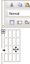
You can manually modify the table's dimensions by pulling its handlers:
In the CellPad text
box (displayed in Simple view)
specify the number of pixels between a cell’s content and the cell's borders
(cell padding). The default value is 2.
In the CellSpace text
box (displayed in Simple view)
specify the number of pixels between adjacent cells (cell spacing). The
default value is 2.
In the Border text box
(displayed in Simple view) enter
the thickness (in pixels) of the border that you want displayed around
the table. The default value is 1. To make the border invisible, set this
attribute to 0.
Note: When the table border becomes invisible, the inside cell
borders also become invisible.
The H Align drop-down
menu (displayed in Simple view)
contains the options for the horizontal alignment of the table relatively
to the page:
Default
Left
Right
Center
In the Header Rows text
box (displayed in Simple view)
enter the number of rows that you will use as the table header. They will
be included in the <thead></thead>
tag. You can definite CSS rules for this tag in the KT_styles.css
file (included in the package) so that the header rows will have a specific
look.
In the Footer Rows text
box (displayed in Simple view)
enter the number of rows that you will use as the table footer. They will
be included in the <tfoot></tfoot>
tag. You can definite CSS rules for this tag in the KT_styles.css
file (included in the package) so that the footer rows will have a specific
look.
Note: When talking about header and footer rows, you must see
the table as having three categories of rows: header, body, and footer.
There cannot be header rows without footer rows. So if you enter a numeric
value in one of the text boxes and leave the other one blank, the latter
will be automatically filled with the value 1.
The sum of the two values entered cannot be greater than the number of
table rows minus 1 (at least one row must correspond to the table body).
So if you choose to work with header and footer rows, and the second value
you enter is greater than the maximum admitted, it will be automatically
decreased to that allowed maximum value.
By clicking the Advanced
button (displayed in Simple view),
the Table Properties panel will switch to Advanced view. You will be offered the
possibility of setting advanced options for the currently selected table.
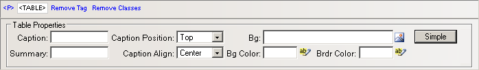
In the Caption text
box (displayed in Advanced view)
enter the text that you want displayed as the table caption (name for
the table). The <caption></caption>
tag is included in the <table></table>
tag.
In the Summary text
box (displayed in Advanced view)
enter the value for the summary attribute.
The Caption Position
drop-down menu (displayed in Advanced
view) contains the options for the caption position relatively to the
table (and its height):
The Caption Align drop-down
menu (displayed in Advanced view)
contains the options for the horizontal alignment of the caption relatively
to the table (and its width):
With the Bg text box
(displayed in Advanced view) you
can set an image as the table background. You can either enter the full
path (URL) to the image previously uploaded on the remote server or you
can click the Browse for Image button to select
an image from the server:
Note: It is your task to make sure the image has appropriate
dimensions, as automatic resizing of the image to the table's dimensions
will not take place.
With the Bg Color text
box (displayed in Advanced view)
you can set the desired background color for the table. You can enter
the hexadecimal code of the color in the text box or you can use the Color Picker
button:
With the Brdr Color
text box (displayed in Advanced
view) you can set the desired border color for the table. You can enter
the hexadecimal code of the color in the text box or you can click the
Color
Picker button:
By clicking the Simple
button (displayed in Advanced
view), the Table Properties panel will switch
to Simple view. You will be offered
the possibility of setting various options for the currently selected
table.
